BRAND DESIGN FOR THIS INNOVATIVE VENTURE CAPITAL FIRM IN THE FOOD SCIENCES INDUSTRY.
OVERVIEW
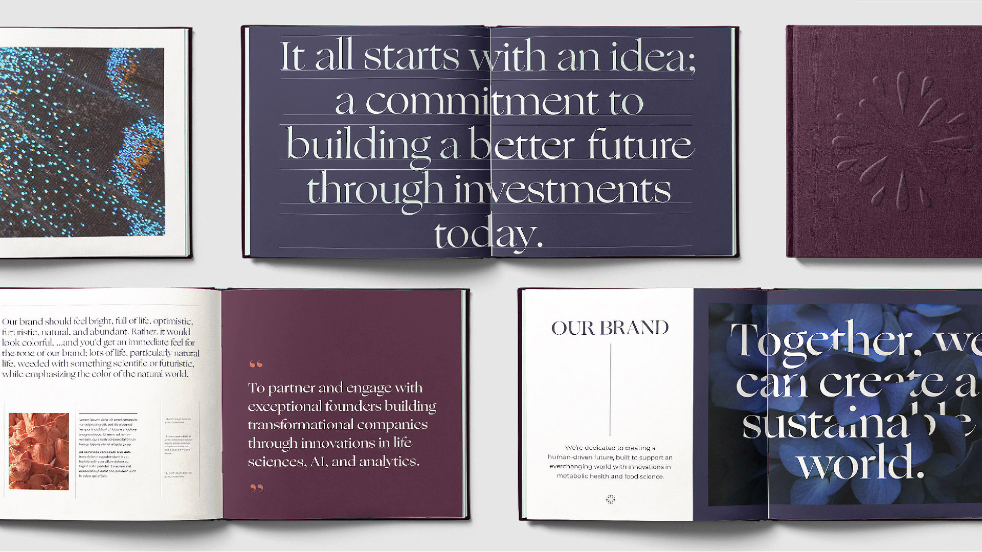
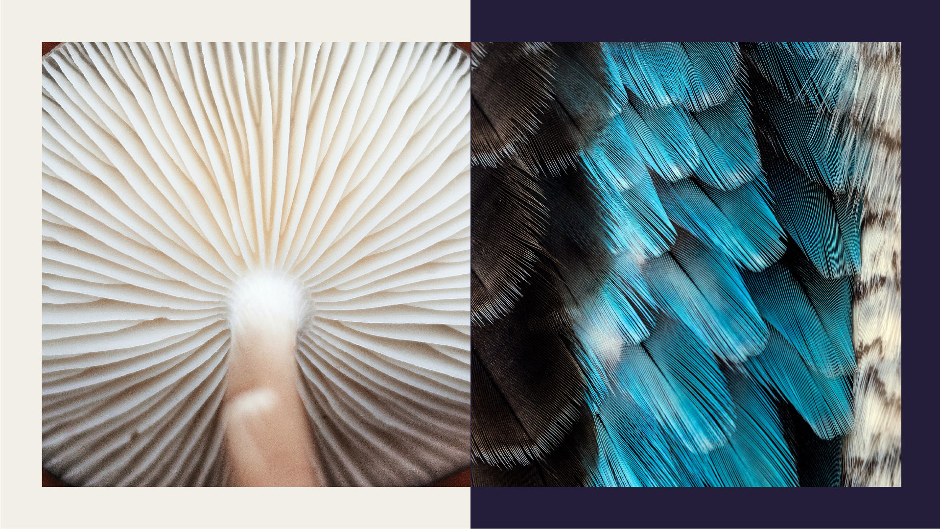
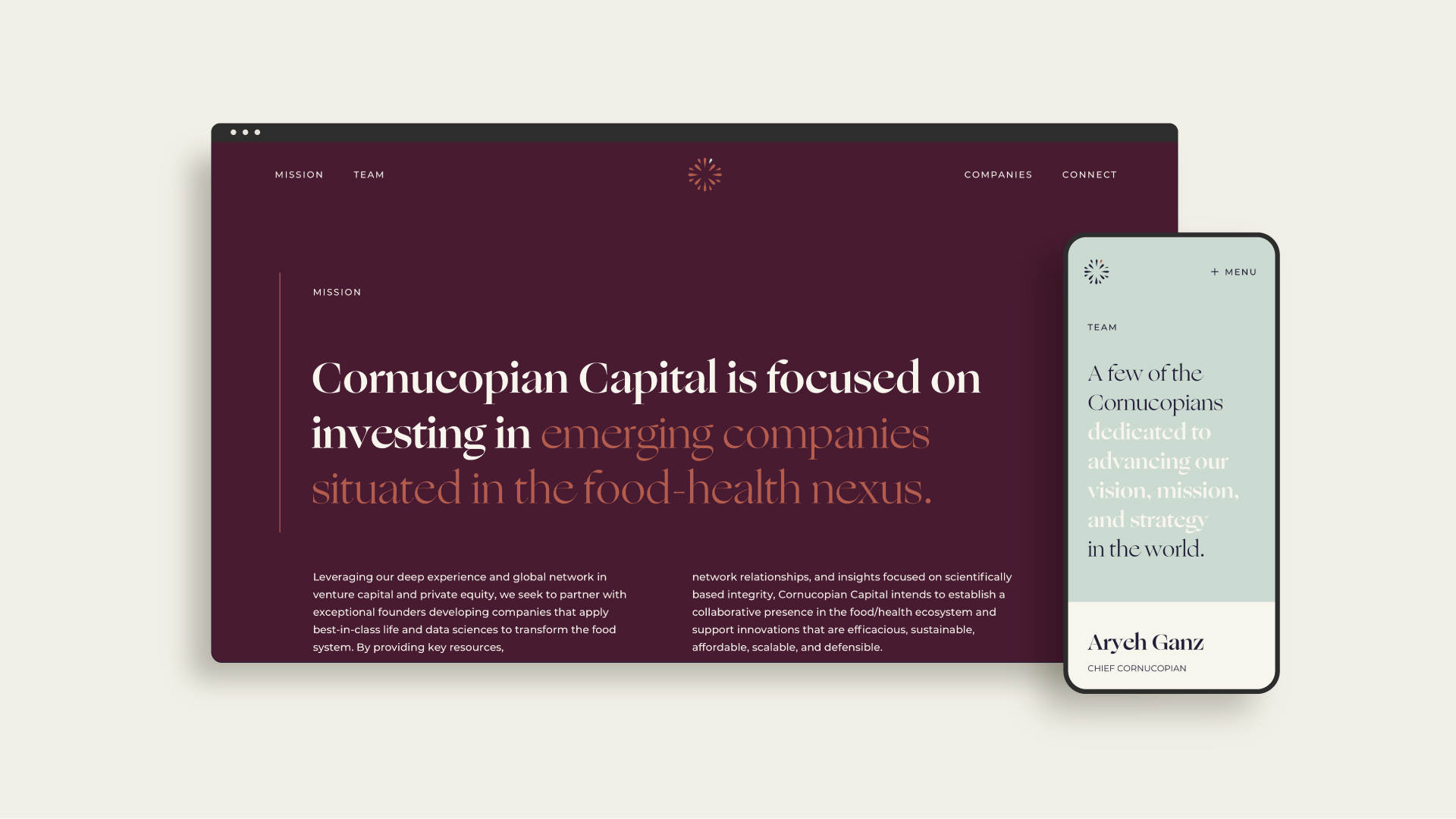
Cornucopian Capital approached L&Co to create their brand ID for the launch of their food sciences venture fund. L&Co started the engagement, like nearly all of our brand development initiatives, with an extensive industry analysis to uncover areas of brand saturation and identify clear lanes of opportunity. Through this research, it was evident that many companies in the market utilized a lot of the same branding and imagery - shades of green, spouts rising from the soil, and farming imagery. We recommended staying clear of all of this and pave a unique, distinct, ownable brand path for the company.
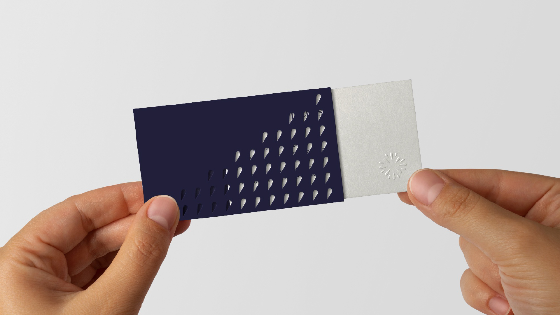
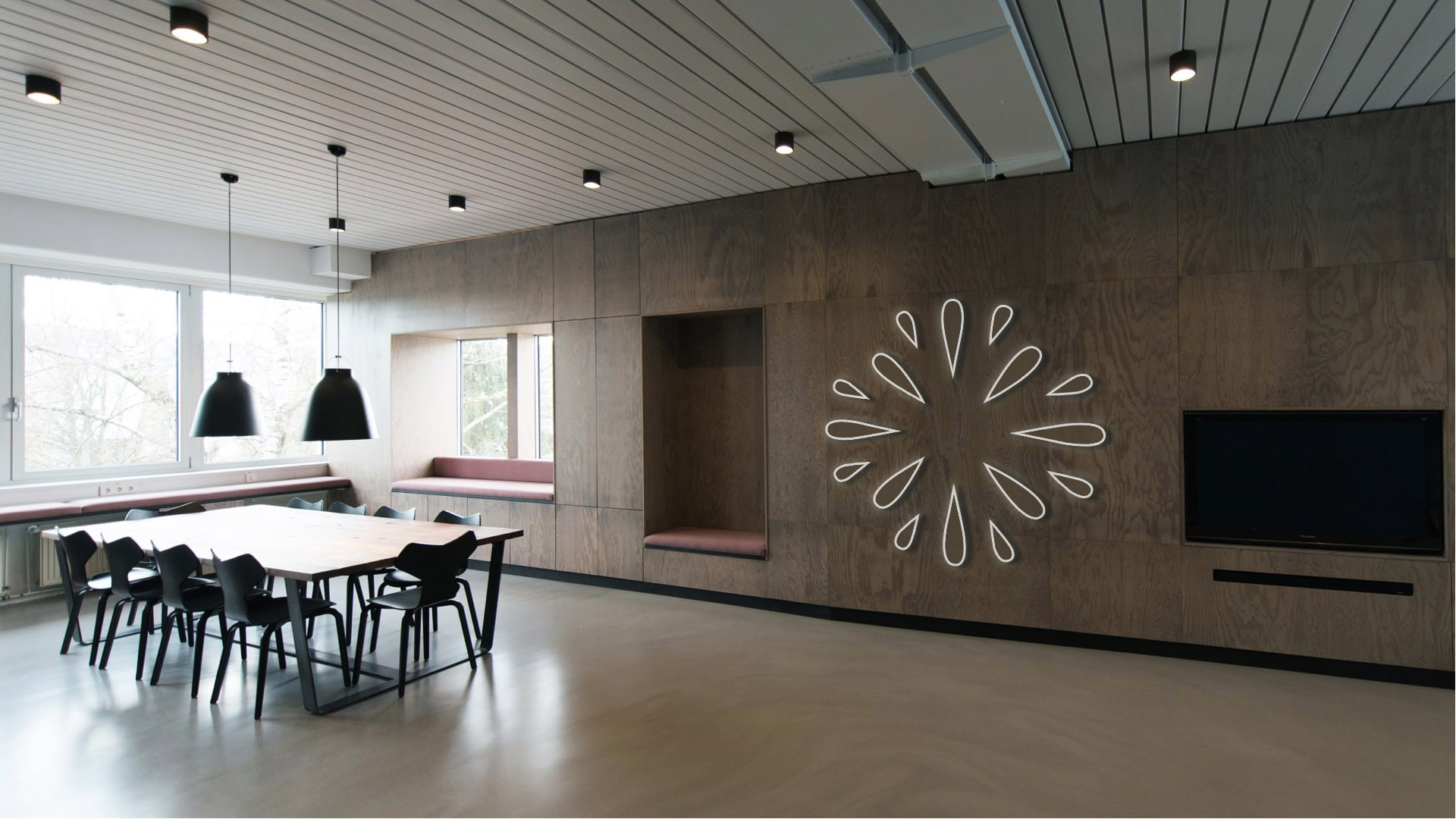
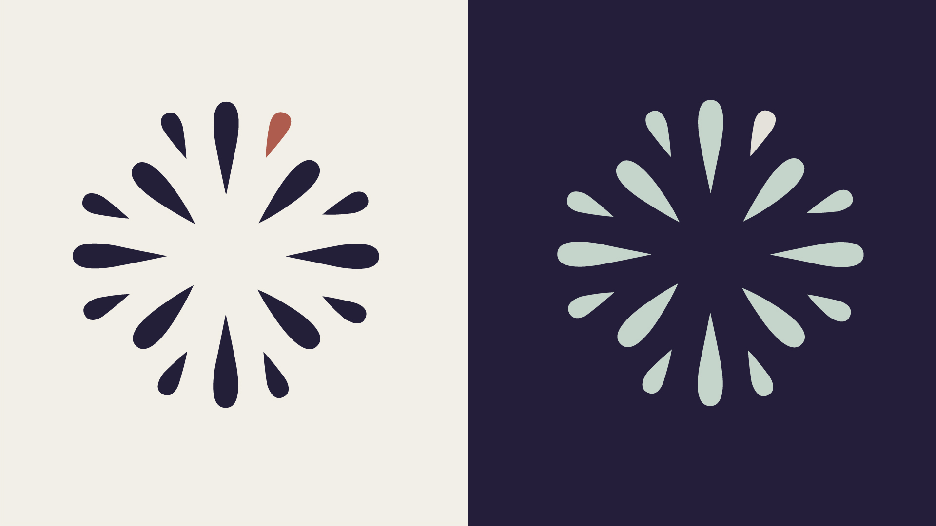
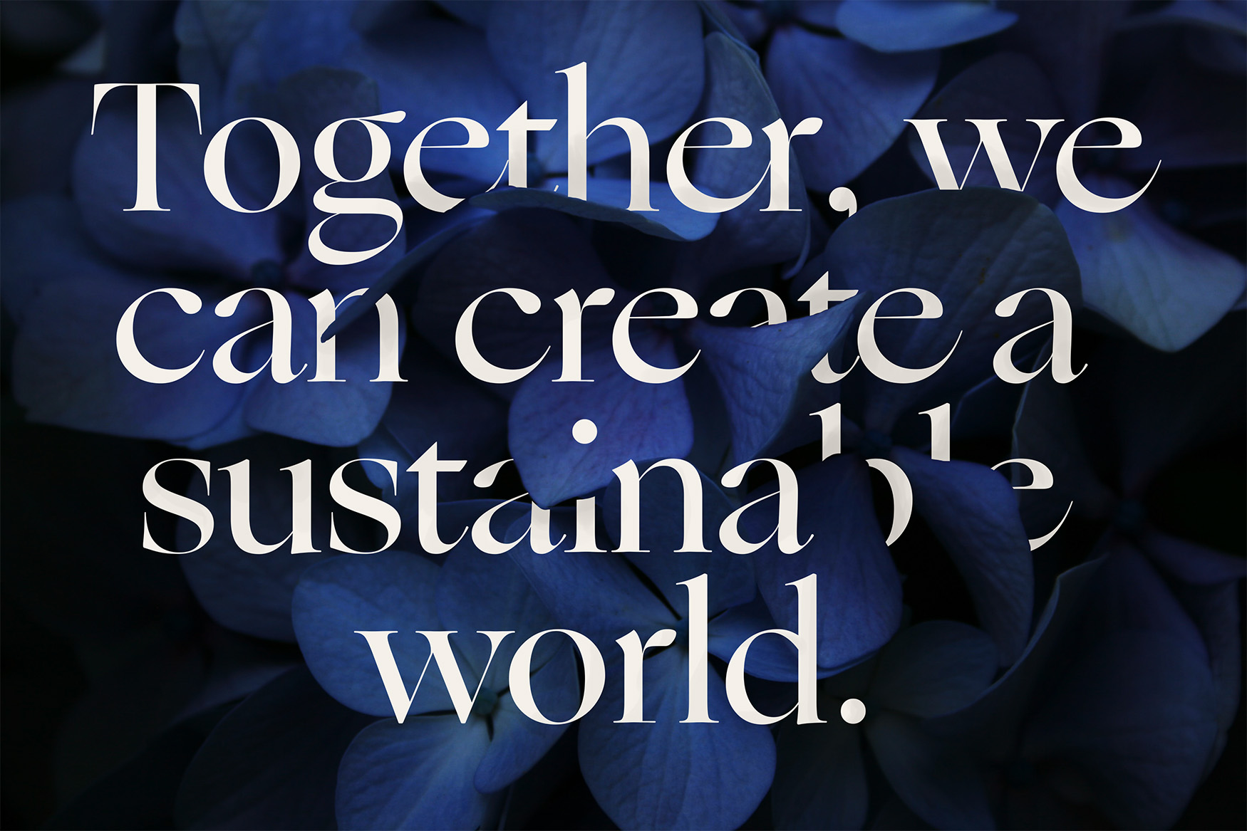
The result is an ID system founded in the architecture of nature, highlighting the stunning elegance of fruits, plants and other natural foods when viewed up close. The logo leverages the literal reflection of a seed - the building block of nature that parallels the company's focus on seed investments in businesses seeking to bring quality food to areas of the world in desperate need of higher nutrition options at lower costs.
CLIENT
Cornucopian Capital
OUR ROLE
Marketing Strategy
Brand Design
Website Design


READY TO WORK?
NEWSLETTER SIGN-UP
INSPIRING AUDIENCES TO ACTION.